|
|
Post by BuckinghamAlice on Oct 1, 2010 20:08:45 GMT -5
@boobrewer Lol. I was offended by Mary Anne's unattractivness. Her teeth and hair and goofy smile hurt to look at. She didn't look a bit like I'd imagine her. And since Mary Anne is my favorite, it seems double awful to me.  Also... on the cover of Stacey's Mistake (the newer one), it looks like Stacey is giving a lecture to Claudia and little Grace Walker. And on the oringinal Welcome Back, Stacey, Claudia looks like she's doing some form of modern dance. On Dawn and The Impossible Three (older cover) Dawn looks constipated. So does Andrew on Kristy's Big Day. And neither MA nor Dawn look like themselves on MA and the Great Romance. Not bad, per se, but not like themselves. |
|
|
|
Post by booboobrewer on Oct 2, 2010 17:43:15 GMT -5
^That's true re: Great Romance. Mary Anne looks like a completely different person from her other covers.
|
|
|
|
Post by virgoscorpio on Jan 2, 2011 18:02:36 GMT -5
starrynight ~ I REALLY liked your website and the comments on the drab covers!
Just one thing: in the Super Specials area, I felt you were confusing Mary Anne and Kristy. In most of the covers. For example, if you look at the Summer Special, when you say the squirrel is in front of Kristy, the girl looks like she should be Mary Anne -- notice the earrings and the hairstyle. I don't think Kristy would have been into that.
|
|
|
|
Post by anzuhana on Jan 2, 2011 19:56:59 GMT -5
You're right, starrynight. These are ugly covers. However, I did like the comments under the pictures.
On the cover of Sea City, Here We Come, Mallory looks horrible.
|
|
|
|
Post by virgoscorpio on Jan 4, 2011 11:47:25 GMT -5
The editors and art team at Scholastic obviously thought that the original cover of "Dawn Saves The Planet" was ugly, too -- because when they re-issued the books with the new covers, they changed the image and Dawn looks much better! OLD COVER:http://www.fantasticfiction.co.uk/m/ann-m-martin/dawn-saves-planet.htm NEW COVER: www.goodreads.com/book/show/371103.Dawn_Saves_the_PlanetAlso, does anyone notice these changes from the old to new covers? Another title I can think of is "Kristy and the Baby Parade" where they totally change the new cover from the original. |
|
|
|
Post by anzuhana on Jan 4, 2011 11:55:53 GMT -5
^ I thought that the new cover of Claudia and Mean Janine looked better than the orginial cover.
|
|
|
|
Post by virgoscorpio on Jan 4, 2011 13:17:50 GMT -5
^ Agree 100%
One thing I always noticed on the cover of Claudia and Mean Janine is the coloured glass windows in the picture behind them.
Also, good consistency because the same windows are on the cover of Claudia and Crazy Peaches!
|
|
|
|
Post by anzuhana on Jan 4, 2011 13:35:19 GMT -5
^ You're right! The windows are the same.
|
|
oldhickory
Sitting For The Arnolds
 Heather Loves Boys and Gym
Posts: 3,251
|
Post by oldhickory on Jan 8, 2011 23:37:22 GMT -5
The editors and art team at Scholastic obviously thought that the original cover of "Dawn Saves The Planet" was ugly, too -- because when they re-issued the books with the new covers, they changed the image and Dawn looks much better! they should have gotten rid of the rest of the book too. |
|
|
|
Post by virgoscorpio on Jan 13, 2011 16:25:10 GMT -5
LOL @ oldhickory.
|
|
|
|
Post by thejunkbucket on Oct 5, 2015 17:47:24 GMT -5
OMG lol I totally agree about the new cover of MA Saves The Day!! She looks really skanky and the paramedic is like, the guy of Stacey's dreams. The outfit MA is wearing doesn't look too "babyish" to me. And what is with the nurse's hat on Jenny? It's a bow. 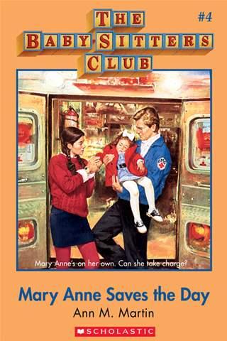 |
|
|
|
Post by Honeybee on Oct 8, 2015 15:22:37 GMT -5
^ I like that cover. Mary Anne Saves the day. I'm rereading that book again.
|
|
|
|
Post by bscfan1997 on Oct 11, 2015 1:11:46 GMT -5
I read through a few pages of this thread, and, wow, the UK covers are really terrible it's tragically hilarious. I honestly like the original covers than the new ones. Idk why. Some new ones are better than the original like Claudia and Mean Janine. Has anyone noticed that Claudia on the book covers doesn't dress all that wild? Mostly solid colored tops, jeans or pants, and side ponytails held up by scrunchies. And Mary Anne's short hair is awful except for The Fire at Mary Anne's House which is ironic because her hair is perfect in font of a burning house  I think Mallory looks hideous on most of the covers. Her hair and face are pretty, but the outfits are, well, sort of pukey. And Jessi looks like a man, nuff said. |
|
|
|
Post by booboobrewer on Oct 11, 2015 13:05:40 GMT -5
Hodges Soileau probably didn't want to deal with the chaos that was Claudia's clothes  |
|
|
|
Post by bscfan1997 on Oct 11, 2015 13:20:21 GMT -5
Maybe so. On Claudia's Friend, her denim outfit is terrible! So un-Claudia, too. More like something Dawn or Kristy would wear IMO. ON MA and the Secret Garden, her coat doesn't seem to fit her. IDK what's exactly wrong with it. It's just off. And the entire cover of Kristy and the Baby Parade gives me nightmares! The green outfit is sort of drab on Stacey's Mistake. Stacey's big, baggy, blue T-shirt in Stacey's Emergency isn't very flattering either. |
|